Color
Red, black, white, gray and tan are often the best choices for web sites because they donʼt create problems for the color blind because they are different in value (light to dark) and, also due to being different hues and intensities, are easy to tell apart. They also project as well as any set of colors and better than most.
They were often used by many of the cultures that developed writing – like the Indo-European, Islamic, Chinese and Mayan. Most of the text was in black and white and red was used for emphasis. (The word rubric, meaning a heading or title, comes from the Latin word for red – rubrica. )
The table below shows how red stands out against a variety of different background colors and as a background color. It also shows how when a color is on a background of similar value and intensity, it becomes harder to see. Notice this with the grays and tans below on background of a middle value and low brightness.
|
White Red Gray Tan |
Tan Red Black Gray |
|
Tan White Black Gray |
White Red Black Gray |
|
Tan Red White Gray |
Tan Red Black Gray |
|
Tan White Red Gray |
White Red Black Tan |
So when you are using colors, you need to know something about the different qualities they have, especially, hue (the color, like green or violet), intensity (how bright or dull it is) and value (how light or dark it is).
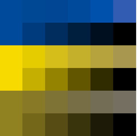
The difference in colors between intensity (bright to dull) and value (light to dark) are difficult for many people to grasp. Here is a graphic showing the three primary colors on a computer (blue, green and red) in rows going from bright to dull and then from light to dark.
For the blue, hex colors #00f to #44b for bright to dull and from #00f to #000 for light to dark.
Green and red showing the same relationships of bright to dull and light to dark are below the blue.
Below is protanopia image of the color table above. Protanopia is a common type of color blindness.
As we saw with the tans and grays above, the context a color is in effects how it is seen. The ✹ below are the same color, hex #c88, but look like they are two different colors and when they placed on lighter (hex #bbc) and darker (hex #778) background colors.
✹✹ |
✹✹ |
The stars which appear to be lighter, the ones on the right, also appear to be larger.
Blinded by Passion/Blinded by Theory is an example of using two colors (hex #f30 and #888) of close to the same value (light to dark) and very different intensities (bright to dull). The combination of the two is what causes the words to vibrate and be hard to read.
Blinded by Passion.
Blinded by Theory.
Complementary colors – those opposite each other – of a similar value have the same effect.
Blinded by Passion.
Blinded by Theory.
Above: hex #f00 on #099, below: hex #f0f on #990 .
A svg file using a red (#900) and an orange (#940) a background color (#456) and opacity.